

Classroom
Our team designed the next generation learning platform for University of Phoenix. Over the course of 6 years, I was a concept designer, lead visual designer, interaction designer (chat, calendar, email, discussion) and manager over the interaction and visual design team.
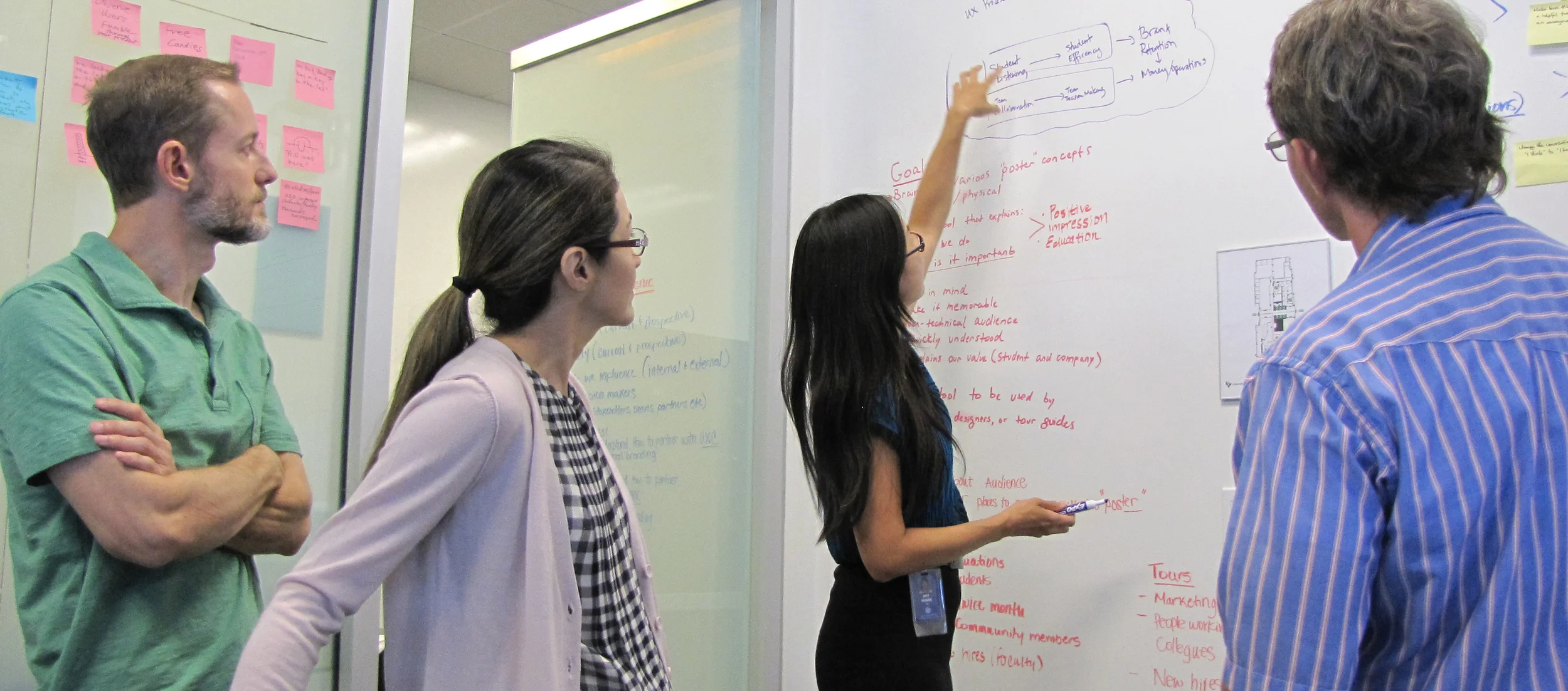
In addition, I was in charge of creating the style guide and pattern library which enabled our designers to have a more consistent experience across our many student and faculty facing applications.
The new Learning Platform was released to 200,000 students and faculty, improving the NPS for new students.
Discussion Threading
The discussion component is the most widely used method of communication in the new classroom. It's the primary way students discuss individual assignments, ask questions, and talk to their instructor. The challenge was making a discussion thread that could be up to 7 levels deep, easily scannable, accessible, and would load quickly. After a series of usability sessions, we were able to quickly narrow down our concept and improve the scannability without overhauling the familiar interaction.


Notifications
Our students were bombarded by various messages and over time, they would start ignoring important alerts. The challenge was creating a messaging system that would provide an easy way to scan high-priority messages, skim non-essential messages, and keep the length of messages manageable.
Our design team created a series of concepts that we brought into our usability lab. Based on the research, we designed a new layout, icons, length of messages, and rules for displaying notifications. The new design was much easier to scan and brought focus to high-priority messages with a clear call to action.

Responsive Design
Concept Testing
I lead the design effort in exploring responsive design concepts for the new classroom. Rather than building a fully responsive site, we used static images and media queries in order to quickly elicit feedback from students.